
Chase automated investing
Role
Lead product designer
Team
1 designer (me), 2 product managers, 1 tech team, portfolio management team, marketing team
Timeframe
October 2019–January 2021

A little background
J.P. Morgan Automated Investing is a robo advisor investing tool available on Chase.com and the Chase mobile app, that gives millions of new and existing customers access to portfolios designed and managed by J.P. Morgan.
How it works

Simulate how different portfolios may perform over time. Answer a few questions about your risk profile and goals, and get matched to a portfolio.

Transfer funds from your Chase banking account, transfer securities or rollover a retirement account.

The robo advisor tracks your portfolio and rebalances it as the market changes. A portfolio with a glide path strategy can automatically reduce your exposure to risk as you near retirement.
After the redesign, J.P. Morgan Automated Investing generated $472 million AUM
as of Jan 2021.
Identify the problem
After a year and a half in the market, we redesigned the platform in order to improve overall satisfaction ratings of our app.
We also were able to:
Address the most important insights from user research, usability issues, ADA violations, and slow load times.
Reduce drop-off rate from marketing page → open account
Understand the users
We identified a pattern experience that caused confusion amongst users—the chart that projects the growth of your money over time. This chart was paramount because we needed to emphasize the exponential effects of compounding interest when contributing to their portfolio each month.
As you change the inputs, the chart displays your projected returns over time.
Novice investors 😟
It looks very technical and intimidating. I thought this was supposed to be easy.
Expert investors 🤨
The market doesn't always go up so smoothly. Where are the peaks and valleys?


Projection growth chart (before vs. after)
In user testing, this new chart landed much better with users. 🙌
We redesigned this chart so that it was easier for users to parse, and moved it to the product landing page to eliminate a step of potential friction and client drop-off.
Designing the new chart
After hearing the promise of potentially reducing client drop-off, the business was sold on this new chart, despite it not existing in our design system.
So, I designed, specced and built the chart with an engineering team, and contributed it to our design system.
See examples below:


Designing with graphical integrity
Because of the range of projections we show in the chart, there were some edge cases that made the chart hard to read. Some thought we should artificially distort the chart to accommodate these edge cases. 🙄
*Note to self: Always design with real data and stress test with edge cases.
The number of information-carrying (variable) dimensions depicted should not exceed the number of dimensions in the data.
— Edward R. Tufte

Getting in the weeds
In order to persuade and educate my team that this was wrong, I followed guidance from Edward Tufte's Principles of Graphical Integrity (#5, specifically).
In this chart, the amount of money is equal to the area of each bar, not its height.
Therefore, to increase only the width for hard-to-read edge case would be disingenuous.
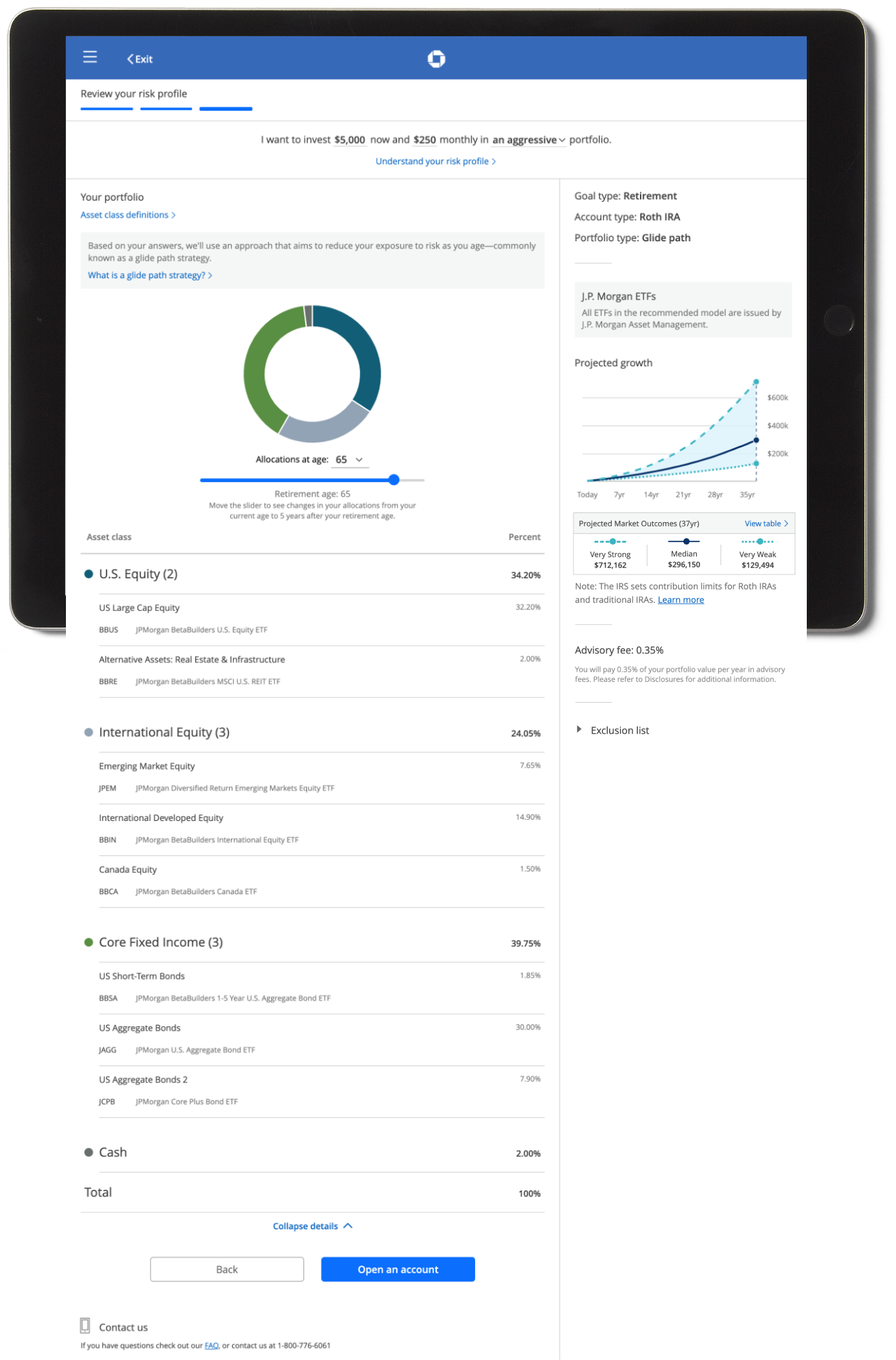
Reduce client drop-off
Problem
Before the redesign, we showed two charts on the page.
In the main content area, we showed a donut chart of the portfolio's asset allocation coupled with an interactive data table below.
In the sticky right rail, we showed a projection chart, a constant reminder of their portfolio returns.
In user testing, we found that people were trying to devise a relationship between these two charts, when, in fact, there wasn't—at least not in the way they thought.

Solution (before vs. after)
1
Streamline the page to one column instead of two, focusing, the experience on one pane of information at a time.
2
Replace the second chart with three potential market outcomes based on the number of years invested.
3
Design responsively for easy scaling for all form factors.
4
Design and build only using full baked components from our design library
"No, I don't take asset classes."
—Melissa, 32
There was one user interview I'll never forget that perfectly demonstrates assumptions businesses often have about their users.
In a user research session, when one participant landed on the final screen of the flow, the moderator probed around the asset classes we were providing in the portfolio.
The participant calmly replied, "No, I don't take asset class."
While this is quite hilarious, it's also very eye-opening. How can we expect prospects to open accounts and add money if they don't understand what they're signing up for?
Final UI
Before

Questionnaire

Your portfolio (collapsed)
Your portfolio (expanded)
After

Questionnaire

Your portfolio (collapsed)

Your portfolio (expanded)